Step 4 of 8
Customizing the widget
Make the widget match your brand and behave the way you want — a quick tour of the six configurator tabs.
Before you start
Your configurator categories are set up (Step 3). From the Guidecom dashboard, click Widget in the left sidebar to open the Widget Configurator.
How this step works:There's no right answer here. Every retailer's brand and catalog is different, so the best approach is to explore each tab, try settings, and watch the live preview update as you go. This guide explains what each tab does so you know where to look.
The six tabs
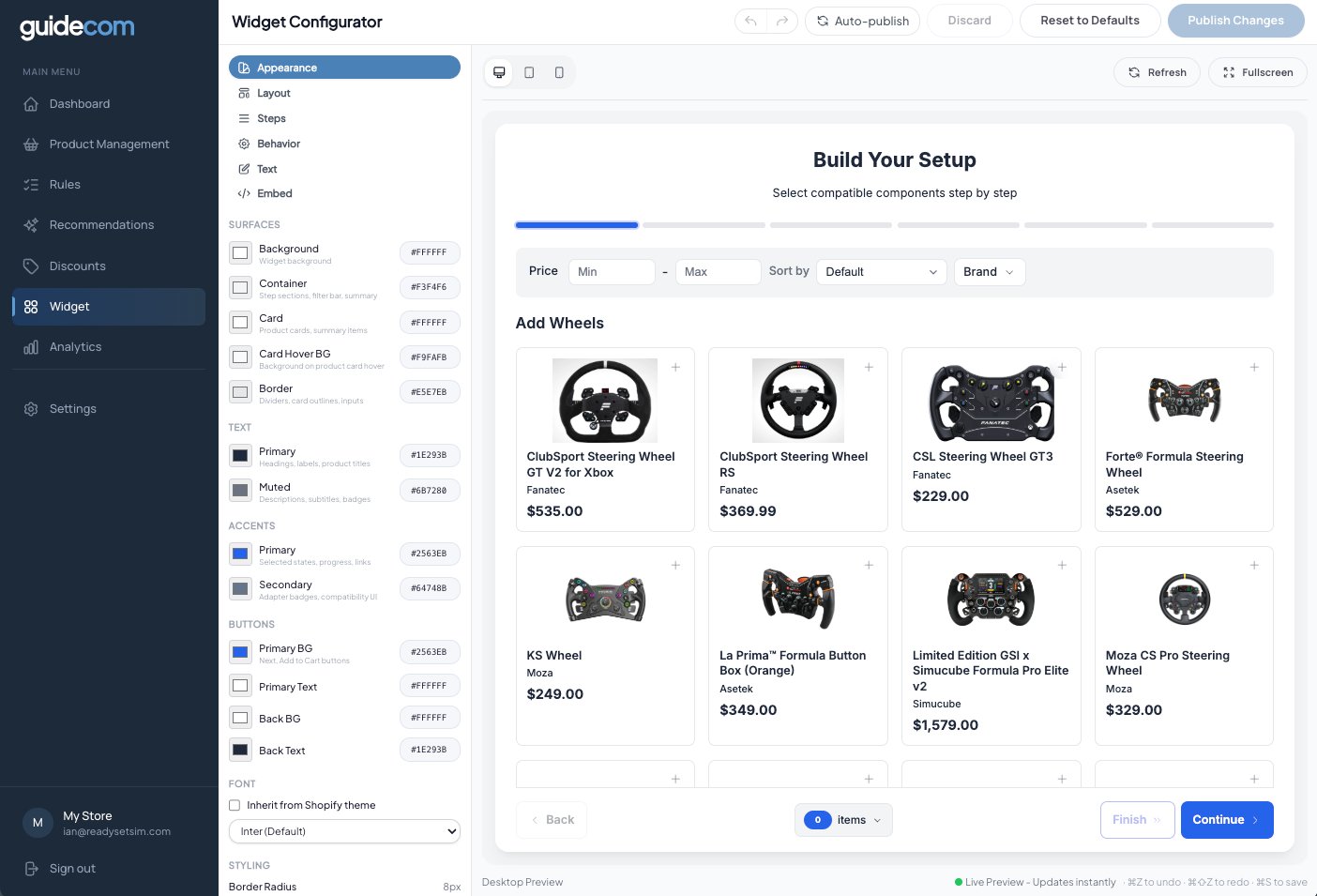
Control the widget's visual style — color scheme, fonts, border widths, shadows, and other surface-level details. This is where most of your branding work happens.
Appearance settings. Colors are organized by Surfaces, Text, Accents, and Buttons.
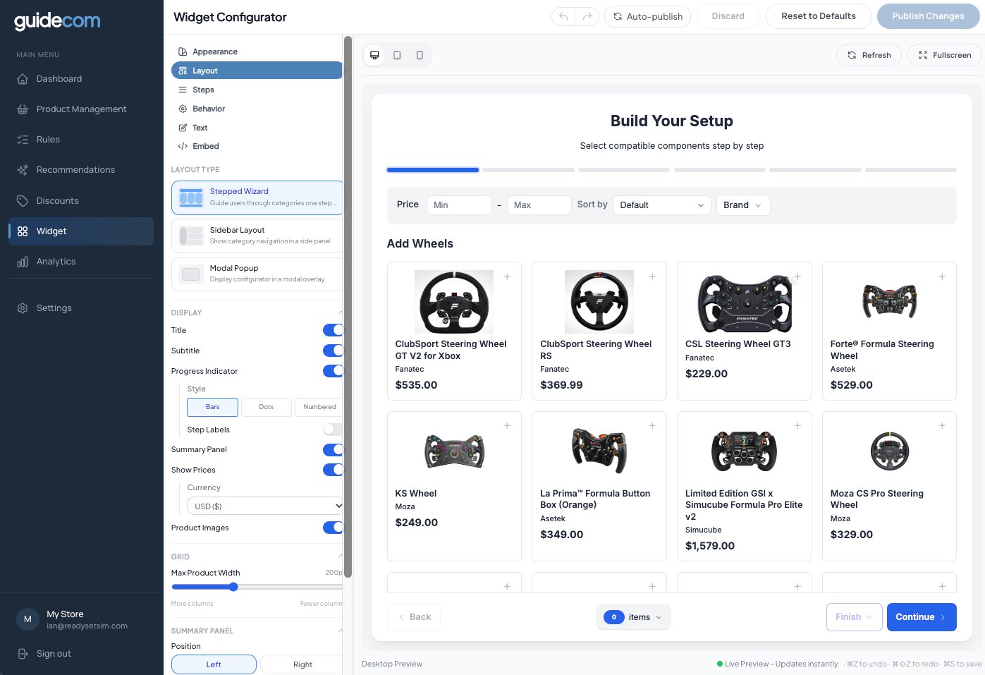
Decide how the widget is structured — stepped wizard, sidebar layout, or modal popup. Adjust display options, the product grid, filters, variant options, and how things behave on mobile.
Layout settings. Pick a layout type at the top, then fine-tune display, grid, and sidebar options below.
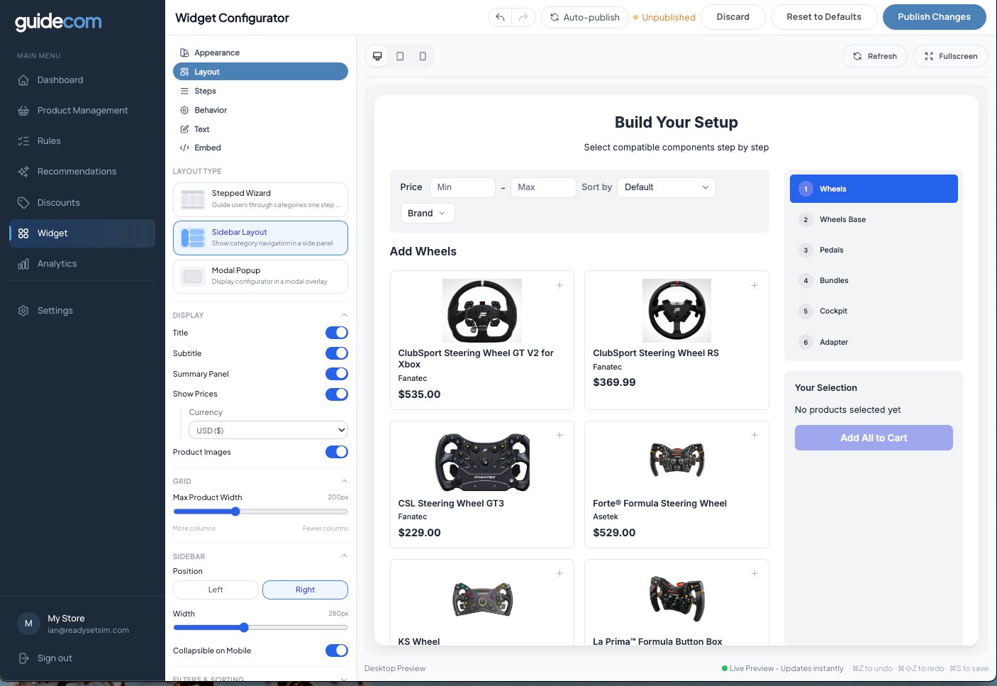
Sidebar layout example:If you pick the sidebar layout, the widget looks like this — category navigation lives in a side panel next to the products. Great for larger catalogs or when you want shoppers to see their place in the flow at all times.
Sidebar layout with category navigation on the right.
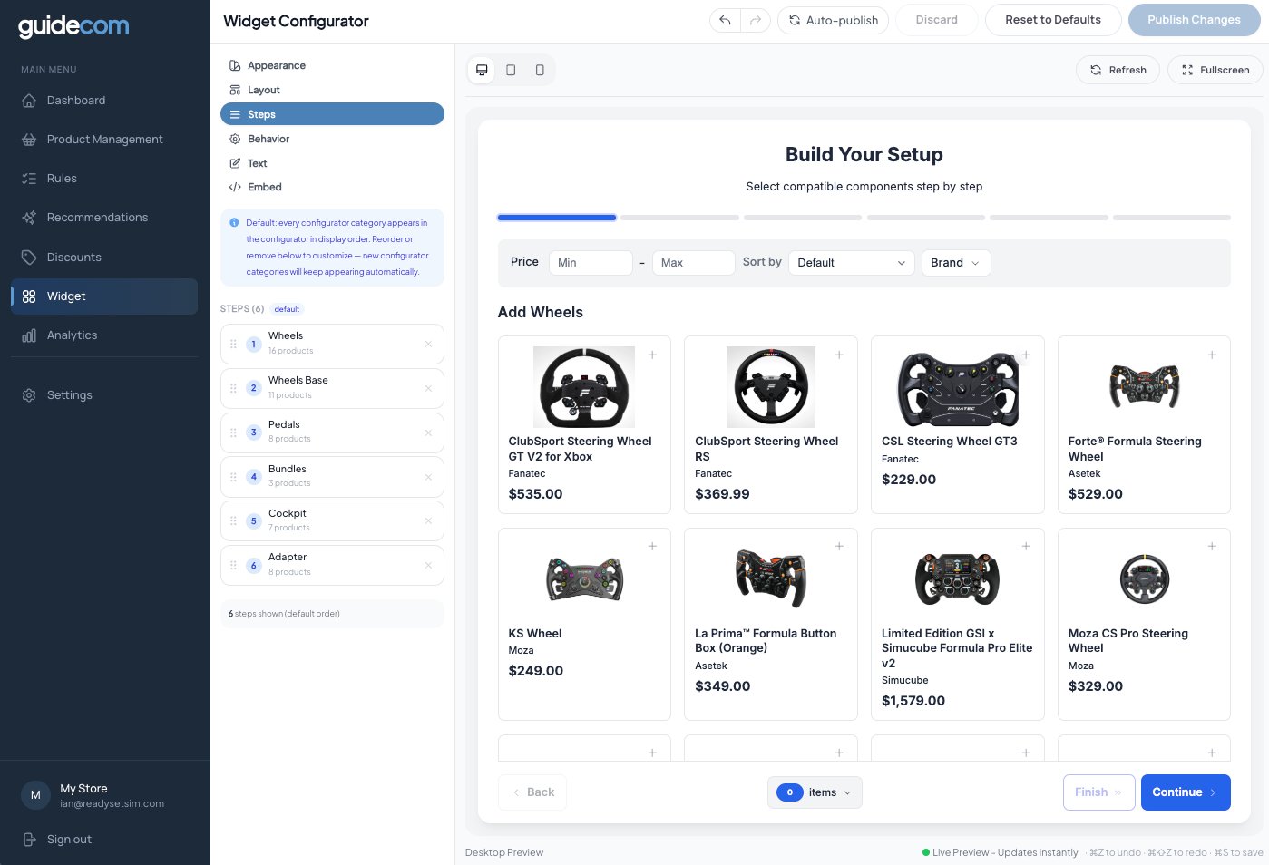
Decide the order of your configurator steps. Drag to reorder, or remove a step to hide it from the widget. Any new configurator categories you create later show up here automatically in display order.
Step ordering. Each row maps to a configurator category you created in Step 3.
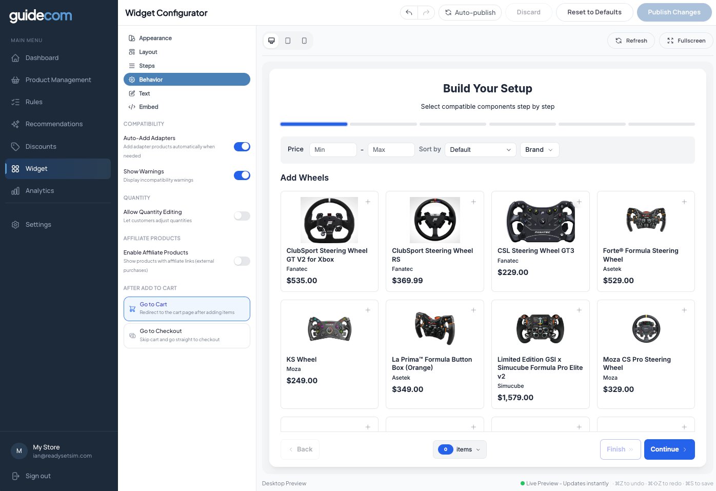
Set how the widget behaves. Turn auto-add adapters on or off, show or hide compatibility warnings, allow quantity editing, enable affiliate products, and decide whether shoppers go to cart or straight to checkout after adding items.
Behavior settings. Each toggle changes how the widget handles shopper interactions.
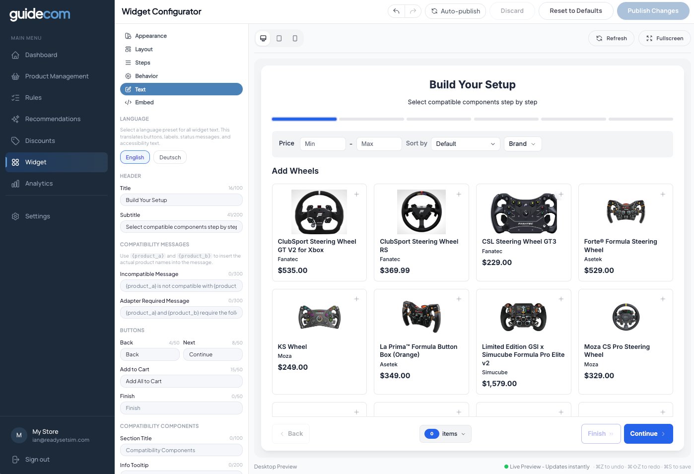
Change every word in the widget — title, subtitle, button labels, compatibility messages, and more. Also where you switch the language preset (English or Deutsch out of the box).
Text settings. Use {{product_a}} and {{product_b}} placeholders in compatibility messages to insert real product names.
Get the code snippet you'll drop into your Shopify theme to put the widget on your storefront. We'll cover this in detail in Step 6 — skip it for now.
Publishing your changes
Changes you make in the Widget Configurator aren't live on your storefront until they're published. You have two ways to handle this:
Auto-publish (toggle at top of screen):When on, every change publishes instantly. Good for small tweaks and when you're the only one working on the widget.
Manual publish:When Auto-publish is off, changes stay unpublished (shown as "Unpublished" in the top bar) until you click Publish Changes. Use this if you want to stage several changes before going live, or if you want a teammate to review first.
What just happened
You've customized how the widget looks, lays out, steps, behaves, and reads. The live preview on the right has been updating as you worked. Once you publish, those changes go out to shoppers on your storefront — but they won't see anything yet because the widget isn't embedded on your store yet. That's Step 6.